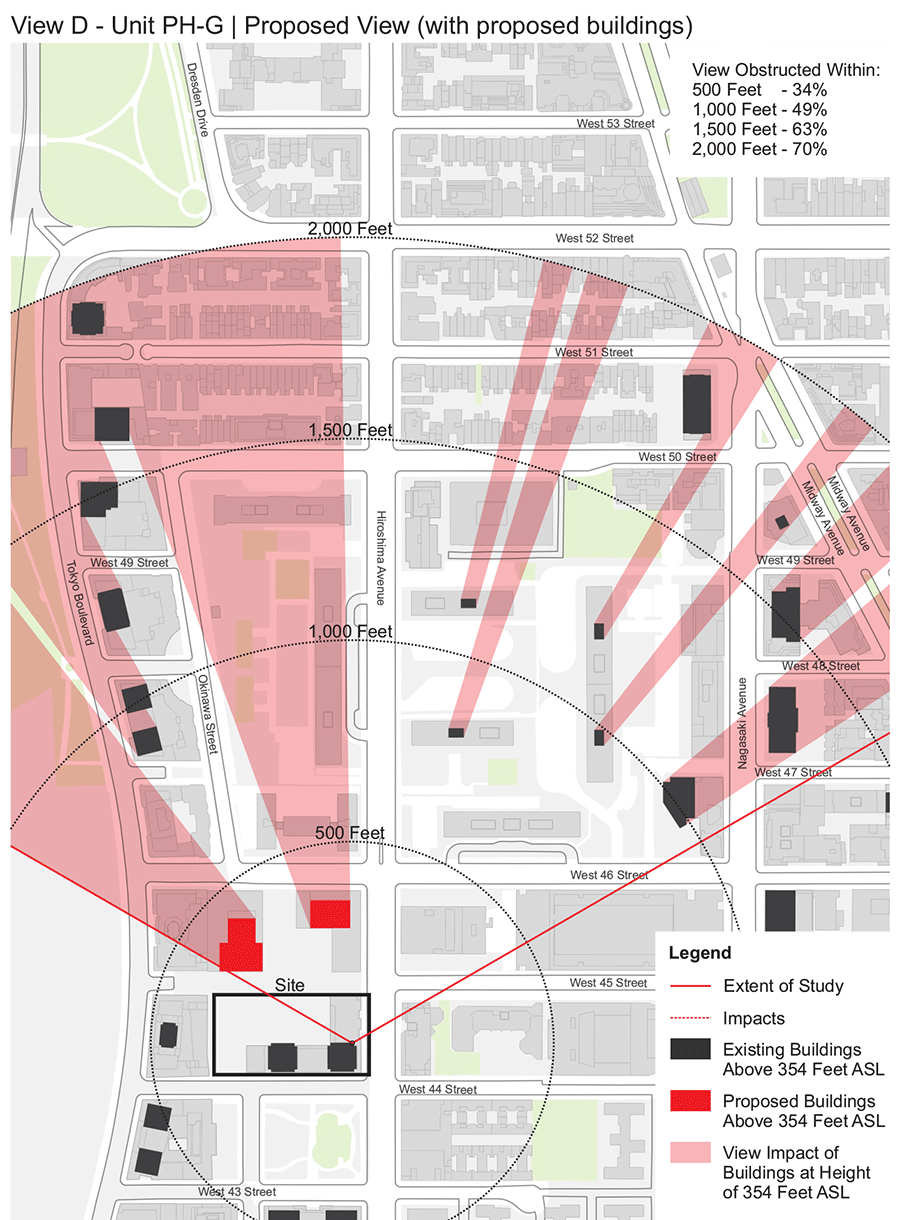
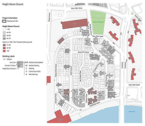
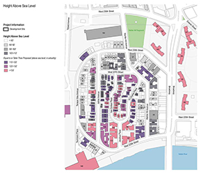
Applicants to New York City's planning office are often required to show supplementary analyses beyond the typical scope of an application if they're proposing a particularly complex or abnoral project.
These maps attempt to contextualize the client's proposal, bringing to light unique characteristics of the site and its surroundings.
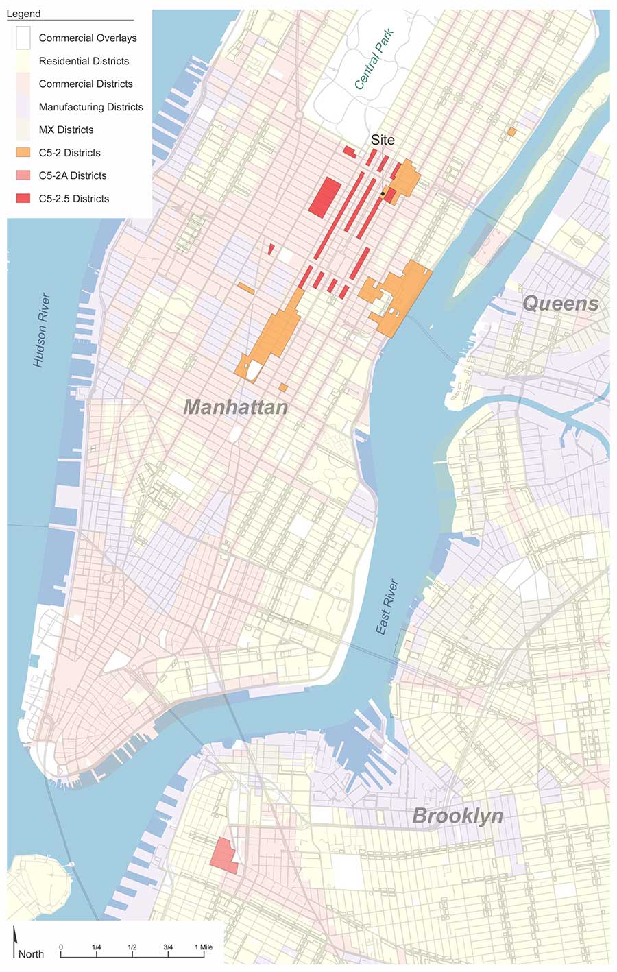
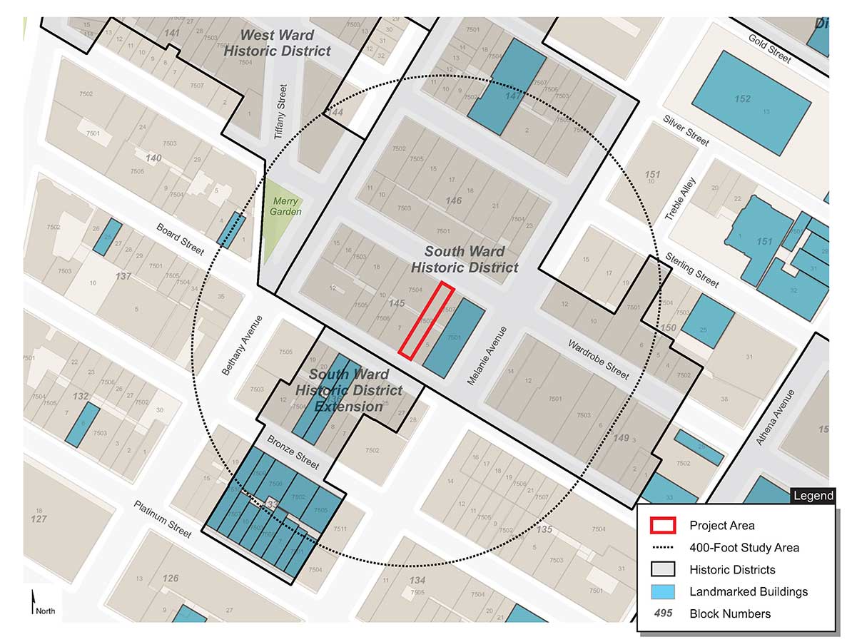
Created with Coreldraw, QGIS
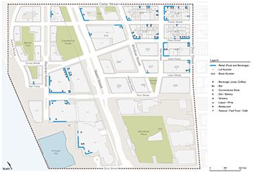

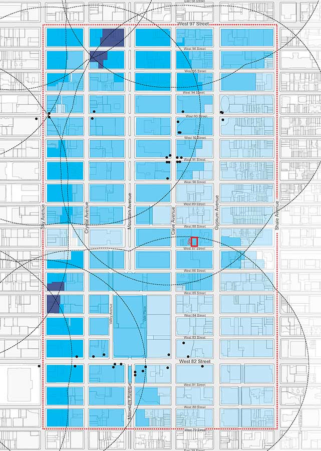
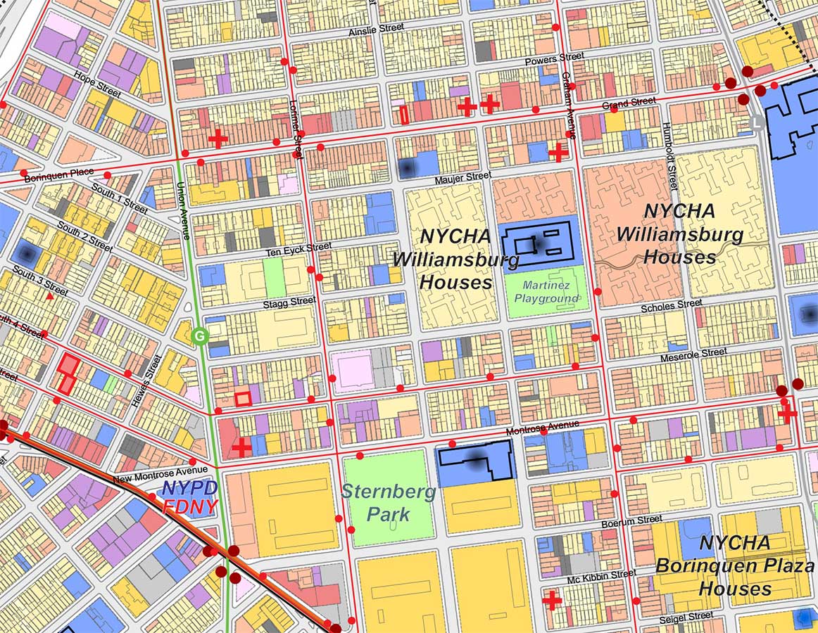
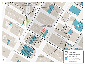
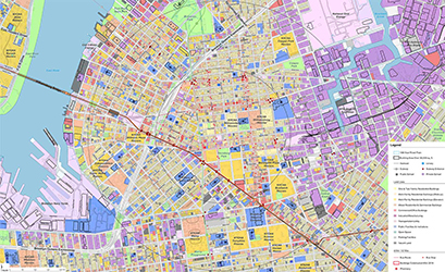
Drawing multiple, overlapping districts can become messy very quickly, but by using a simple color palette the user can easily view where each district begins and ends.
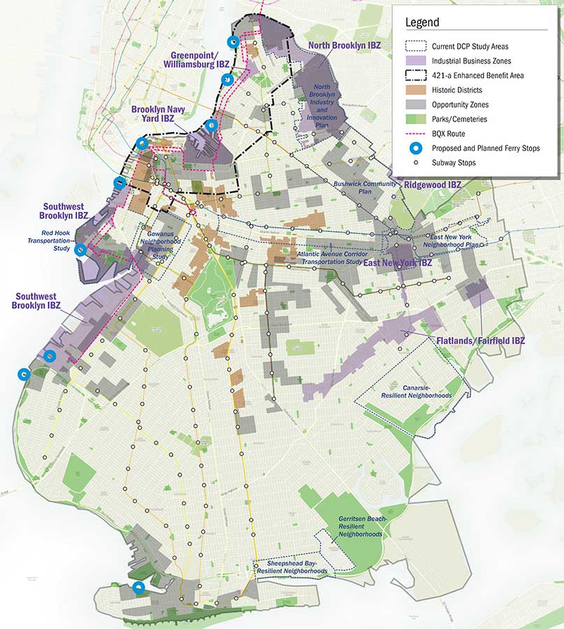
Created with Coreldraw, QGIS


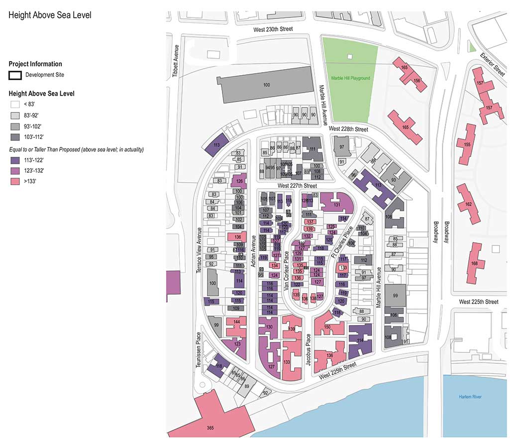
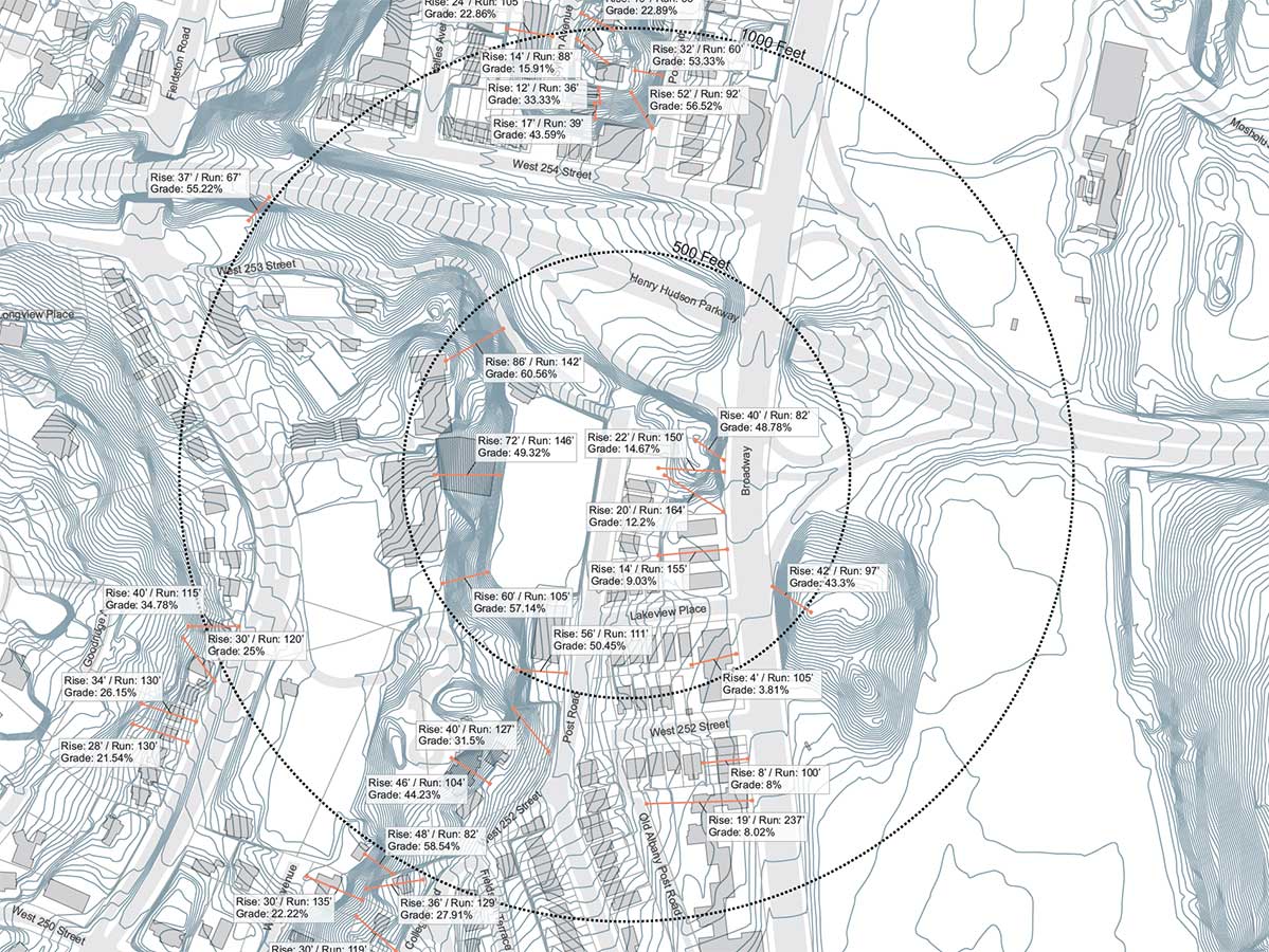
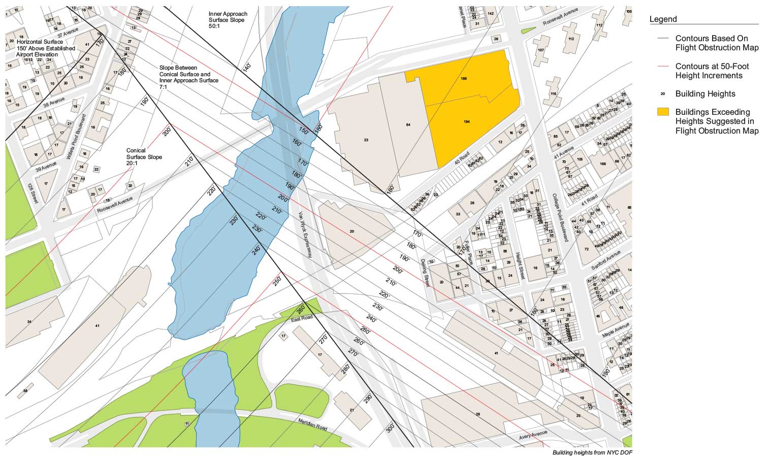
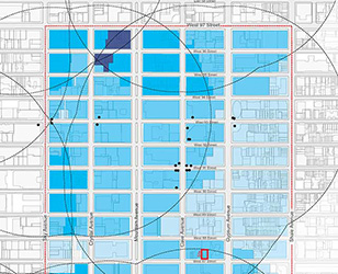
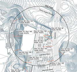
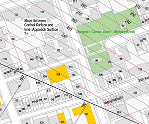
Whether it's topography or flight paths, contour lines enable one to visualize changes in slope, regulations, and other parameters.
Created with Coreldraw, QGIS

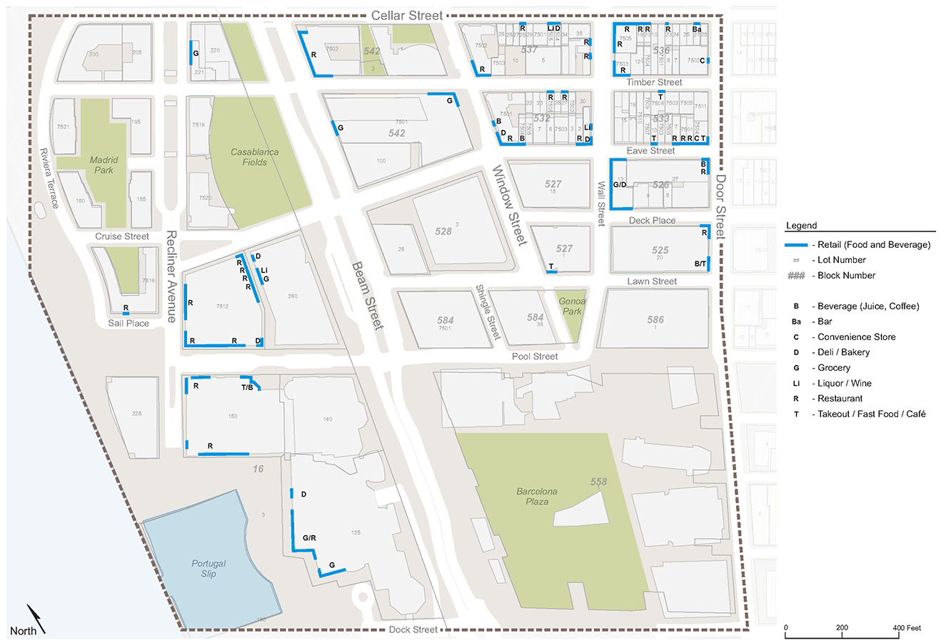
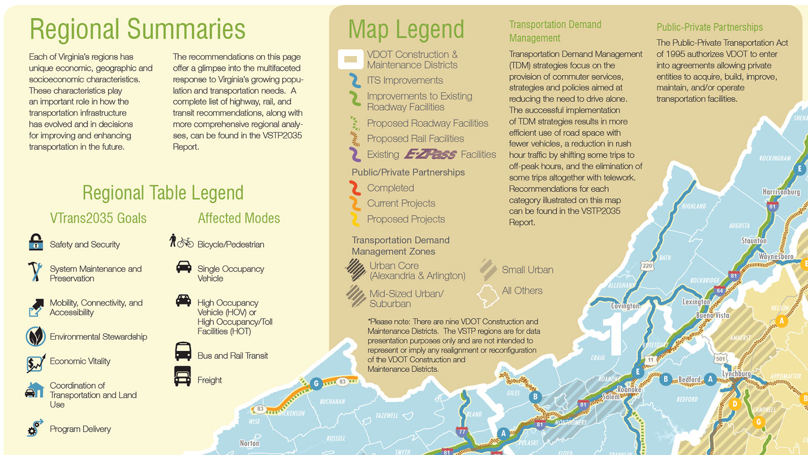
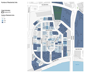
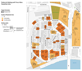
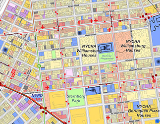
On occasion, the city or a client will request a map with more layers than is advisable, due to the visual complexity of so many overlapping colors and shapes.
Nevertheless, when possible, I try to keep things simple, and I make sure everything is at least in the legend.
Created with Coreldraw, QGIS
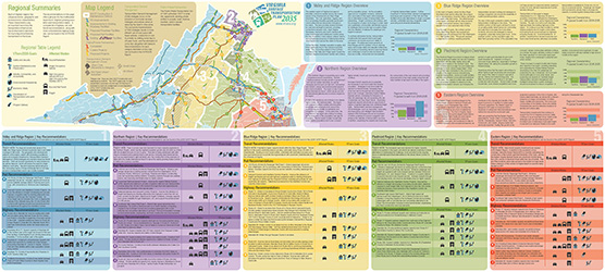
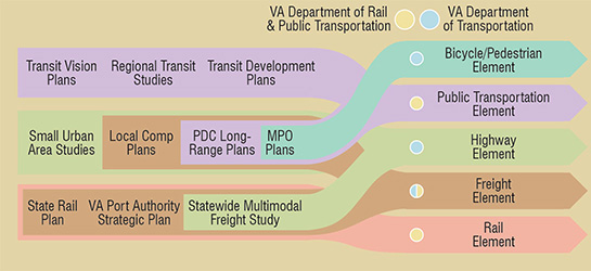
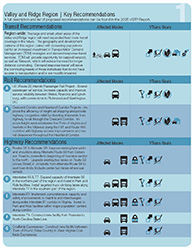
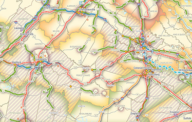
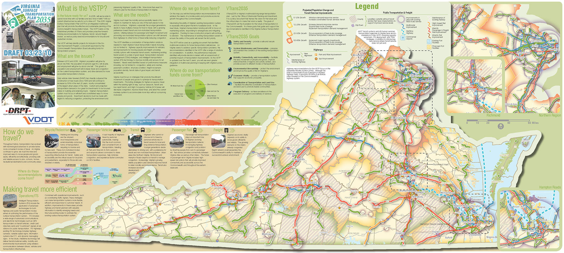
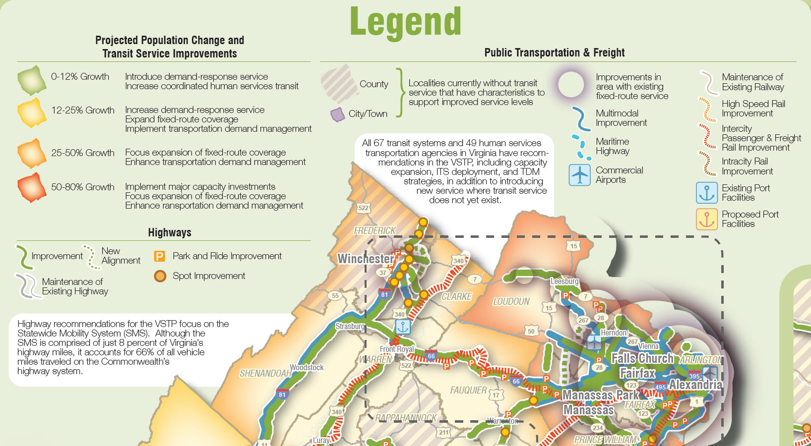
Working with Virginia’s Department of Transportation and Department of Rail and Public Transportation, I organized all major roadway and transit improvements recommended for the next several years into an overview map accompanying a more detailed technical report. This exercise enabled lawmakers and citizens to conceptualize broader trends affecting individual improvements, highlighting the need for initiatives such as regional rail networks and intelligent transportation systems.
Created with Illustrator, Indesign, ArcGIS